Monday, November 30, 2015

Scratch Game Design


Thinking about the user experience while creating a game in Scratch is incredibly important. The programer has to think about how the user experience might feel while playing this game. UX- a short cut for user experience- refers to a user's emotion and attitude while using a product. It includes: visual design, functionality, usability and typography, etc.

The similarities features between my 3 games are there is a ''goal'' that both sprites are trying to achieve. It's just either for the dog to NOT touch the ball, or for the snowman to reach the Christmas tree or for the stickman to reach his destination. Also, all of my game can only be played by the arrow keys. The contrast features in my 3 games are the themes are very different. The codes goes from easy to complicated. And only 1 of the games has the additional feature called ''death'' which you can check how many times your character has died.

I think in my last game, Operation Freedom, the pen code was the best code. It worked really well and smooth. During this project the most difficult bug fixes to me were to make the characters jump and move very very smoothly and also to create the second level without interacting with the first one. Creating scratch games can be enjoyable and frustrated. Enjoyable because you are creating your own games. Frustrated because sometimes you don't know how to combine what codes that go together to create a movement. After all, coding isn't really my jam but glad I got to try it :)


Sunday, November 29, 2015

Invention Commercial


Our team's main goals for this assignment were to entertain the audience and make them understand what our invention was. Keeping the audience entertained was pretty hard. Whenever I watch commercials I always expect they to be funny, I do not want to sit on the couch and stare at the television with a plain face. The invention was not difficult to make, but the way we film and explain to the audience what it is through entertainment is the tough part.

To me, the best team moment we had during this project was when we filmed/act and how it took us several times to get just 1 scene done. Alani was the friend #1 who asked what the Zip Zip was, I (Tu) was the second friend who had the Zip Zip on. I think it is pretty strange when in reality when we are having a conversation with someone, we look straight into their eyes and that does not turn out to be funny at all, but in acting when I was having a conversation with Alani, I could not stop laughing, I kept stumbling on my words.
During post-production editing, I was the #1 editor who put things into order based on our ''Invention Commercial Plan". Because Meagan did the filming so I decided to do the editing. Meagan was also the #2 editor, the reason why is because apparently the plan was changed, and she wanted to help me to fix that part. Alani mainly just sat next to us and advise us to do edit things the way they should turn out to be.

Friday, November 6, 2015

Composition Scavenger Hunt


From the 20 Composition Techniques I have learned, the one I think is the most important is leading lines. They are the most effective compositional tool commonly being used by photographers. Leading lines are used to draw a viewer's attention to the main subject. Our eyes naturally drawn along lines and paths in photos as they tend to make us feel as if we are standing within the photo itself. The easiest place to find a leading line is on a road. Roadways are inherently leading because they go somewhere, give us a feeling of motion, and the lines often point so far inwards that they reach a vanishing point.


In my opinion, macro is one of the most difficult technique out of the 20 techniques. The photographer has to get really close to the subject, but also has to be careful so the picture will not turn out to be blurry. It is even harder when it comes to taking pictures of people, because then the lensman has to come really close to that person, which will create uncomfortable feelings. We can apply this technique to almost everything, but nature would be the easiest.


In this project, our class was divided in to different teams. Meagan is an awesome and thoughtful person that always make sure the team gets their work done. She is the main editor, she helped by editing and cut the video and put them into order. Alani who is positive and so hilarious that always makes the team laugh. She helped the team by putting transitions, texts into the video.


Friday, October 23, 2015

Cracking the Code


Everyone should learn to code. You can learn to create apps, read codes. It might gets really difficult but it helps to train your brain to think more complex. Learning to code is like learning a new language. Smartphones, computers, calculators, basically almost every electronic thing around us is rely on codes. Without codes, they will not be able to function/operate. Did you know that computers are actually not that clever, however they are pretty obedient, they will do exactly whatever you want them to do. How is that possible?!!... By using codes ;).

My first experience with programming was easy, but as the level gets higher it gets harder. The program adds every different block every level. It also teaches you math like moving the character in different angles (45 degree angle, 180 degree,...), you have to calculate which angle to move though. After that you get to see what code you used for your level. I even got a certificate!!

If I could design any program or game I would design something that has a limitation of time that you could go on social media and alert to your parent's phone when a person online is trying to bully you. For example, social media such as Facebook, Instagram and Twitter are pretty addicting, and that is not good. Sometimes, you are too busy to go on those things but forget to notice what is happening around you. Social media is also where cyber-bully happens, there is no boundaries, the other person on the other side can say whatever they want to, use profanity, lower your self-esteem down on purpose, etc. My program would have a timer that only parents can adjust how long they want their children to be online, and yes children will have their own privacy, the parents will not be able to see what they are doing online, but if someone is trying to bully your children, the program will immediately send an alert message to the parents.


Friday, October 2, 2015

My Humorous Monologue


Did you know that, in comedy, body language takes up to 55% out of 100%, voice infection/ tone is about 37%, and words/ sentences is the least which is 7%. What I learned from this project was writing a comedy story is not easy at all, especially for the people who aren't funny (like me). It was hard to make a funny video with the limitation of 30 seconds to 60 seconds. I had to plan, think and prepare for each one of my b-roll, how is it going to fit, how long is that scene going to be, but it still ended up not what I expected :(. It was actually my first time I got to plan my own video, and Mr. Sanderl (our GT teacher) even provided us with a template that we can do our timing, audio and visuals which turned out to be better than if we do do all that stuff on our own. 

Pad is an additional clips you add before your actual video starts and ends. Padding your clips are very important because when you start to film your video, you might say ''1,2,3 start'' and you do not want the audience to hear when you say that so you will need to have extra spaces to cut it out. If you don't add pad, you're going to have to re-do it or else the audience would be like ''Wait what? What did that person say at the beginning?".

My weakness in this project was my video was over 1 minute. Some parts did not make sense because I guess I was in a hurry to to put an end in my story. My strength in this was I was not a procrastinator. I got started right away when I got all my b-roll done. What I could have done better was, I could have chose a topic but that will not take up a lot of time. And I should have added more effects and sound to make it more ''cool''.

Wednesday, September 16, 2015

Comedy Writing


Why do you think sense of of humor is an important character trait?? Hmmm... From MY opinion a good sense of humor is one of the most important human qualities. It can release the stress you get from work or school,.. .We can use our joke to make ourselves feel better, to lighten our spirit. It can also increase your productivity when you doing some works. Unfortunately, some people do not have good sense of humor, and that is totally okay, we were born to be different. ;)

There are 5 tips I would like to give you in writing a humorous narrative. 1st: Look at things that you are surrounded with, it might apply to other people as well. 2nd: If there isn't anything around you that you find is funny, try to think of your own joke and make it longer, usually a joke is about 8 seconds, you can take that 8 seconds and add more interesting things into it, but remember it has to do about the topic you are talking about. 3rd: You can think of the funny/ hilarious moments you had with someone. 4th: You can make your humorous narrative a what they called ''low comedy'' type which includes physical mishaps, coincidence,.. that will cause the audience to laugh out loud, lol. 5th: Try to share it with your friends, and see if they find it funny.

My comedic monologue is about my really good friend, Kiara. I came up with an idea of doing it on clumsiness because I figured that is what most people would find it pretty amusing. I am not a clumsy person apparently so I could not do it about myself, so the first person that pop up in my mind was Kiara. She's not really clumsy, but she can act like she is pretty good and of course working with my good-friend would be fabulous!! Being funny is not my usual thing, having to write a humorous narrative is even more difficult! My comedic monologue is funny because it relates to everyday life, how you and your best-friend/good-friend will always have fun no matter what. Also it's because there's this scene where I freaked out, banged my head to the bed and kind of...''bottom burp'' so I think that part will get the audience to laugh:)


Wednesday, September 2, 2015

Motivational Poster

Hello my amazing readers! Currently we are doing this super cool project in my GT media class, it is called Motivational Poster!! The requirements that we had to do for our Motivational Poster were to have 4 total images: 3 symbolic images that represent who you are and 1 portrait up close of your face. Must have 2 separate text layers :Manifesto and Quotes, so the total of layers are 6!! For the design expectation, all text should be KERNED to fit across the entire page with NO holes or blank space. Triadic Color Scheme of 1 dominant and two accent colors. Blending options are definitely needed in order to make your text stand out, it includes drop shadow, outer glow and stroke, etc. Adjustment for the layers has to be right, or else everything will go off.


1st: I started with 2 text layers- Manifesto and Personal Quote. 2nd: I created another layer with 4 images (3 symbolic that symbolizes you and 1 portrait of my face!!). 3rd: I kerned the letters so they'll will fit my entire page, it was pretty hard. 4th: I used Triadic Color Scheme for my text color. 5th: I went to ''Blending Color Options" to make my texts stand out. 6th: I turned of my text layers to edit my symbolic images by using color balance, exposure,.. and I'm done!

My biggest challenge doing this project was to make the texts fit the entire page so there will not be overlapping and touching words. I had a lot of holes and blank space, but when I kern it, it overlaps the others. What I would improve is to make my texts shorter but meaningful.  I thought my work turned out to be pretty cool, especially when I applied the color balance ;).


Thursday, August 20, 2015

Personal Manifesto


Hey guys! Welcome back!! Let me tell you some interesting facts about myself. I was born in Vietnam. I moved to the United States and lived in Maryland for about 3 months, then my parents decided to move to Kauai, Hawaii. Rain makes me happy, seriously it can change my mood from sad to happy, I don't know how or why, it just does. I love animals, I think I might become a veterinarian ;). I love pizza, I can eat it anytime, and anywhere :) #pizza is life

My 2015-2016 Manifesto!!

Be HAPPY. DON'T ever base your HAPPINESS on someone, they''ll DROP it. Live your life with no regrets. Be SATISFIED with what you haveIf you're not happy with something, SAY it and CHANGE it. JUDGING people DO NOT define who they are, it DEFINES who YOU are .DON'T ever use someone's PAST to against them. Getting LOST is not a waste of time

My manifesto applies to my readers in many different ways. It was meant to motivate them and think positively. My manifesto could also be somebody's trying to achieve their same goals as same as me. Reading these manifestoes can really help you see things differently (good way).

Wednesday, May 27, 2015

Music Videos Rock!


.

Each of our team members contribute by: Meagan, who came up the ideas what we should in our video, where we should film and helped us with the production plan. Tessa, who is so funny, she will make you laugh in this video, even though this song is kind of sad. She also came up with the idea of filming at her house, for extra scenes in case we need them. I contributed by get the team together on schedule for meetings and get things finish before it is due!

The part that our audience will enjoy the best is how we came up with all the ideas to make it as possible as the original video. The cut in and cut away also will be the part the audience will enjoy, it 's kind of give the audience ''excitement'' and really get their attention. We took A LOT of scenes, and spent time cutting them. We used some effects for ''memories'' in our video. This video is appropriate for any age.

We knew how to cut music parts and put them where they should be. We used effects, kenburn, cut in and cut away, etc. We also made a poster which we learned how to do awhile ago. I have learned a lot this year. I never knew I can make and edit these videos until I signed up for GT. THANK YOU MR.SANDERL !!!

VIDEO COMING SOON!!!

Friday, May 8, 2015

Lyrical Livelihood


My favorite song is ''It's our world" by Jacquie Lee. Whenever I hear it, it makes me feel really happy. Because based on the lyrics, they're mean, there is always tomorrow, keep on doing whatever you want, be yourself, make life worth it, you only live once. It's okay if sometimes you fall down but just don't give up, just take one step at a time and you will reach your goal. It is also about how the world is in our hand. BE the change that will improve our world.

Our music video is going to be ''One last time'' by Ariana Grande. We picked because it is now a very popular song, and we know the lyrics pretty well. Also, we did not know any other songs to choose, if we did, they were chosen by other teams anyway. We were really having a hard time of choosing songs.


The visual story that our music video will tell is about a broken friendship. We was going to do boyfriend and girlfriend because that is exactly what this song is about, but since we did not have a boy in our team so we chose do to about a broken friendship (girls). We will film it in the library, school's field, and in our class. We''ll try to make it looks like we were somewhere else not at school.


Wednesday, April 22, 2015

Our animation story


Our stories focus statement is ''Cyberbully affects Tu''. We are doing this topic because it has been and still is a major problem through out the world. Cyberbullying causes people to be emotional and physical stress. Everyone's response to being bullied is different. But according to research, most youth (teens) have a higher of risking their life because of depression and anxiety. A lot of time, a simple joke can even put someone from happy to depression. Also, there is this common thing in school when someone says '' No offense BUT....." as soon as you say '' No offense but.." then it sure will be OFFENSIVE. Example : "No offense but you are ugly'', -.- that is already OFFENSIVE. Think before you speak!!

The audience will learn that why is cyberbullying isn't a thing to be joked around with. It is a very serious problem. They will also learn that how a little joke they say might hurt someone, WITHOUT THEM EVEN KNOWING IT. When you are being bullied, the best thing to do is to talk to an adult or a friend. Usually, youth will choose to talk to their friends, because they think that telling their friends will be better because they have the same ages and understand each other better. Just like me (the victim) in the story. But some choose to NOT tell anyone at all, keep it all to themselves, and that is not good, you'll never know what they will do.

My best moment was when we worked and discussed things together, and when all of us actually worked on something not just fooling around. I am very happy that we chose this topic, because this is middle school major problem and it's our age too. My worst moment was when we kind of got loose on doing things and realized it is due in 2 days and when we transfer stuff in the ''Transfer folder" but it wouldn't let us to do it so we had to redo everything again. We did not really know what to do the first 2 days, but after that everything is all set ;). WE ALSO GOT CHOSEN TO BE IN THE CONTEST AT THE FILM FESTIVALS. Our video may not win at the Film Festivals, but what is most important to me is we had fun doing this project and we learned! I love my teammates, they are amazing.

Here are some photos behind the scenes and when we edit stuff.


This picture is kind of too bright, but it was when Leilia working in Stykz

Sunday, April 19, 2015

Animation Outtakes


Now, it is 4th quarter in school! We are doing an amazing and interesting project calls '' Animation Project". Our teammates are: Dylan, Leila, Tyler, Tessa and me. I am so happy I got to work with Dylan, he is a 2nd year GT student which is a good thing because he will know what to do exactly and can guide us through. Tessa is a smart girl and always knows how to work things out. Tyler is also a very smart and a very fun person to work with.

Stop motion is a technique used to make any certain kind of object seems as it is moving by itself. A GIF( bouncing ball) is another kind of animation, but looks more realistic as in real life. GIF stands for Graphic Interchange format. These animations are very fun and interesting to work with.

We are telling my story. The title is '' Cyberbully affects Tu". We should care because cyberbully is a major problem in the world. Every single one of us have been bullied before, and we know exactly how it feels. A lot of people in the world ended up committing suicide, especially teens because of bullies. A little ''joke'' you say, you might think it is not a big deal, but it can risk someone's life. Think before you say.

Here is another GIF but made from Photoshop

Friday, March 13, 2015

Typography Images

Typography is the style and appearance of printed matter, also the art or procedure of arranging type or processing data and printing from it. A typography portrait is an image of a person's face covered with words. They are not just words, they basically have to have words that describe the person's character trait. It can be used with images to make a lasting impact by

To create an typography image was very hard for me. My biggest challenge during this project was to make the words to be seen clearly on the person's face, but all the layers in order, and especially to have all the shadows, mid-tones, and highlight to be equally. It was very hard to make those three turn out the way you want to! . It took me a long time. I tried to catch up with my teacher's demonstration but it was still difficult and confusing. Of course lucky me! My friends and my teacher helped me so I got it all set ;)


The first example was an innovator example. We were basically looking for an image of a famous person, and finding words that describe them. The second was the one when we took a close up photo of our teacher's face. And the third one is another typography image of me.

Wednesday, February 25, 2015

Double Exposed Portraits


Portrait Photography is usually photos of the person's face, but the background and entire body maybe included. It can also displays that person's expressions and mood of a subject. It is as same as when you are taking family portrait for any special events.  A profile is similar to a portrait photography because their pictures are always of a person's face, the only thing about profile is you can't really see the the face, mood or expression, because you can position anyway you want. A silhouetting is different from two other ones because you can take a picture of person, place or thing. The silhouette is only one color that matches the outline of you subject. It appears in a solid shape. The only thing that portraits, profiles and silhouettes are basically the same because the subject is usually a human.


You created double exposures in Photoshop by starting off with File > Scripts > Load Files into Stack that is the 1st step, I had three photos; 2 textures and a profile 2nd: Crop your photo. Make sure it set to 8.5 * 11" 300 px/in and the edges of farm are equal. 3rd: Use the dodge tool to make sure that your background is completely white, you can also use the paintbrush tool. 4th : Blend your photos together by clicking twice on one of your textures and click on Blend Mode >Screen, doing the same thing with the other one. 5th: To make your photos look majestic, go to Layer> New Adjustment layer, and explore!! Remember to SAVE YOUR WORK!!!!


I took a picture of flowers, because I love flowers and their beauty. I also love palm trees because they make me feel peaceful and they make Hawaii becomes more beautiful, especially when there's sunset.  Everyone is like a flower, different and has their own beauty, that is what so unique! I love how I used curves, saturation and gradients to make my final picture ''stand out'' more. I learned it from my practice photo. I think my palm trees could be improved because you can barely see them. At first, I thought this project is complicated but when you get into it more, it gets easier, and you will be in LOVE with it!!


Practice

Final Work!!


  1.    

Monday, February 9, 2015

HDR Photography


HDR means High Dynamic Range, it creates photos with gorgeous, impossible detail and clarity. Also, instead of taking one photo, HDR uses three photos, taken with different exposure, they can combine all of the dark and light side in a photo and make a new photo with a balance lightning. It used for when you took a really nice photo but the lightning is bad. I really like this setting, it might takes a long time to combine all the lightning together to give you a great photo, but it is worth it, trust me!

To create an HDR image step-by-step, you open Photoshop, go to file, automate and then click on merge with HDR pro. A chart will show up, click on browse to find the images that you took, then drag all of them to put into that chart, when you did that it will take awhile to load, because Photoshop is using its ''brain'' to work hard. You will see a lot of options on the right hand side when Photoshop is done with its job. Yes, it is totally different from the automatic HDR functions! You can edit however you want in Photoshop but the automatic one it just makes the lightning balance.

I took a landscape picture of a look out in my property. I wanted to show everyone some of the beauty things around them. I can't still believe that I am living on a beautiful island with so many amazing things surround it. For the portrait, I took a picture of my mom, I should have told her to not put her hand on the coconut tree so it would make it easier for me to put her in with the landscape photo without cutting her hand off! Anyway, if I get to do it again next time, it would be better, I learned a lesson ;).


Tuesday, January 20, 2015

Movie Trailer Critique


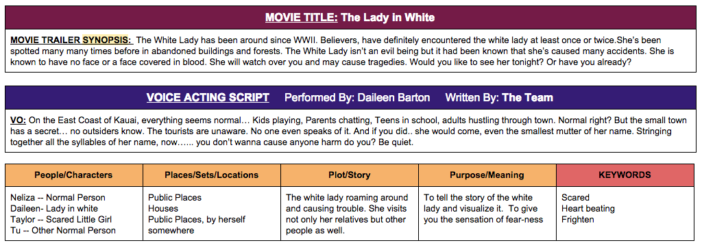
Last quarter, we did a project name The Lady In White. It was a movie trailer that we asked to do. You can think of any movie that you have seen or you can think of one your own and act it out. Ours was from a story. My teammates were Neliza, Taylor, Daileen & me. In the movie trailer The Lady In White, Daileen was the main character, she was the lady in white, Taylor was the sacred little girl and so was Neliza, I was just a normal person. I edited some shot, scheduled time for the team to meet.


The project requirements were to appropriate for Kindergarten kids, timing has to be from one and an half to two and an half minutes, at least five scenes, voice acting script, text layovers, filter and music, those were the main ones. We completed all of them. Our trailer I think was appropriate for the audience. But we could have done better by make it a little more funny, because the audience are the kids, and they like things that are funny. Of course, our trailer was not a funny one, it supposed to be a little scary. We were going to put some more scenes in, then we realized that we had to make it APPROPRIATE for the audience, so we refused to not put them in.


Most our classmates voted us satisfactory. I agree with them. We could have done better. Lucky, none of our scenes were repeated. My team worked really hard on editing, that was the hardest part & took a long time. I learned that it is very important to work together when you are in a team. You can get all your scenes done in just one day if you work together. Each person of our team knew what they were supposed to do, no-one was playing around. I just love all of my teammates, they did a really good job!! I am very proud of our movie trailer.