
You created double exposures in Photoshop by starting off with File > Scripts > Load Files into Stack that is the 1st step, I had three photos; 2 textures and a profile 2nd: Crop your photo. Make sure it set to 8.5 * 11" 300 px/in and the edges of farm are equal. 3rd: Use the dodge tool to make sure that your background is completely white, you can also use the paintbrush tool. 4th : Blend your photos together by clicking twice on one of your textures and click on Blend Mode >Screen, doing the same thing with the other one. 5th: To make your photos look majestic, go to Layer> New Adjustment layer, and explore!! Remember to SAVE YOUR WORK!!!!
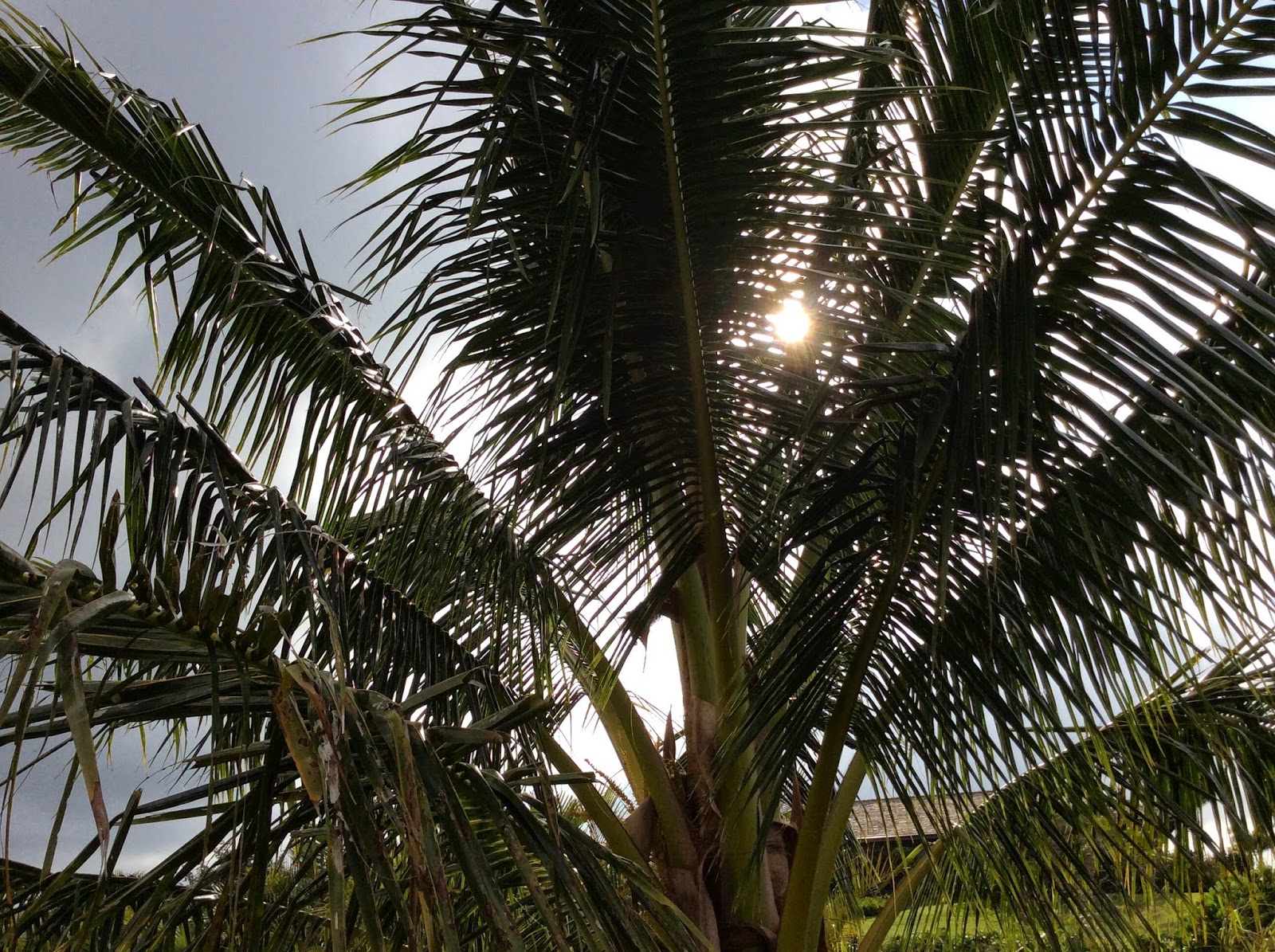
I took a picture of flowers, because I love flowers and their beauty. I also love palm trees because they make me feel peaceful and they make Hawaii becomes more beautiful, especially when there's sunset. Everyone is like a flower, different and has their own beauty, that is what so unique! I love how I used curves, saturation and gradients to make my final picture ''stand out'' more. I learned it from my practice photo. I think my palm trees could be improved because you can barely see them. At first, I thought this project is complicated but when you get into it more, it gets easier, and you will be in LOVE with it!!
.jpg)

Practice

Final Work!!
I like your final!
ReplyDeleteI cant really see the flowers.
Great practice!
I like your images.
ReplyDeleteI cant really see the flowers
Really good dodge out quality
The texture is very nice
ReplyDeleteThe palm trees could be more visible.
The color is very vivd, and that makes it look better
I like your two symbols.
ReplyDeleteIt its hard to see the two images together.
I like your overall image.
there are a lot of vibrant colors
ReplyDeleteyou can kinda see the palm trees
great overall image
Great color scheme it works really well
ReplyDeleteI can barely tell what your message is.
Overrall it looks really cool.
I really like the colors you used!
ReplyDeleteIt's hard to see the palm trees.
I love your final picture !
I like the texture you put on your final product!
ReplyDeleteI can't really see your two symbols.
I love your overall image!
My favorite part of your work is the colors.
ReplyDeleteYour message sorta works because you can only see one symbol.
Something that could of been improved is to make the palm trees more visible.
Compliment: Amazing Photos
ReplyDeleteImprovement: Can't really see the flower
Compliment: Love the colors
This comment has been removed by the author.
ReplyDelete