Friday, March 13, 2015

Typography Images

Typography is the style and appearance of printed matter, also the art or procedure of arranging type or processing data and printing from it. A typography portrait is an image of a person's face covered with words. They are not just words, they basically have to have words that describe the person's character trait. It can be used with images to make a lasting impact by

To create an typography image was very hard for me. My biggest challenge during this project was to make the words to be seen clearly on the person's face, but all the layers in order, and especially to have all the shadows, mid-tones, and highlight to be equally. It was very hard to make those three turn out the way you want to! . It took me a long time. I tried to catch up with my teacher's demonstration but it was still difficult and confusing. Of course lucky me! My friends and my teacher helped me so I got it all set ;)


The first example was an innovator example. We were basically looking for an image of a famous person, and finding words that describe them. The second was the one when we took a close up photo of our teacher's face. And the third one is another typography image of me.

Wednesday, February 25, 2015

Double Exposed Portraits


Portrait Photography is usually photos of the person's face, but the background and entire body maybe included. It can also displays that person's expressions and mood of a subject. It is as same as when you are taking family portrait for any special events.  A profile is similar to a portrait photography because their pictures are always of a person's face, the only thing about profile is you can't really see the the face, mood or expression, because you can position anyway you want. A silhouetting is different from two other ones because you can take a picture of person, place or thing. The silhouette is only one color that matches the outline of you subject. It appears in a solid shape. The only thing that portraits, profiles and silhouettes are basically the same because the subject is usually a human.


You created double exposures in Photoshop by starting off with File > Scripts > Load Files into Stack that is the 1st step, I had three photos; 2 textures and a profile 2nd: Crop your photo. Make sure it set to 8.5 * 11" 300 px/in and the edges of farm are equal. 3rd: Use the dodge tool to make sure that your background is completely white, you can also use the paintbrush tool. 4th : Blend your photos together by clicking twice on one of your textures and click on Blend Mode >Screen, doing the same thing with the other one. 5th: To make your photos look majestic, go to Layer> New Adjustment layer, and explore!! Remember to SAVE YOUR WORK!!!!


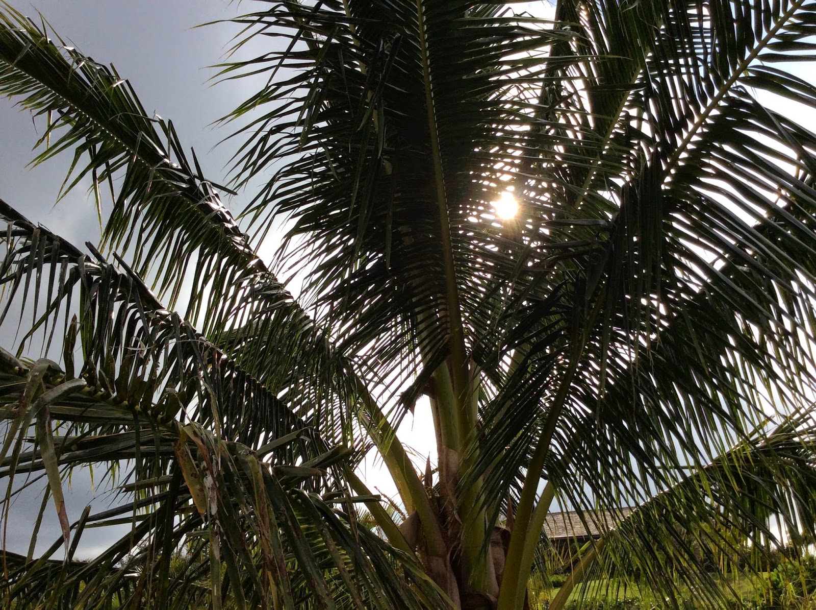
I took a picture of flowers, because I love flowers and their beauty. I also love palm trees because they make me feel peaceful and they make Hawaii becomes more beautiful, especially when there's sunset.  Everyone is like a flower, different and has their own beauty, that is what so unique! I love how I used curves, saturation and gradients to make my final picture ''stand out'' more. I learned it from my practice photo. I think my palm trees could be improved because you can barely see them. At first, I thought this project is complicated but when you get into it more, it gets easier, and you will be in LOVE with it!!


Practice

Final Work!!


  1.    

Monday, February 9, 2015

HDR Photography


HDR means High Dynamic Range, it creates photos with gorgeous, impossible detail and clarity. Also, instead of taking one photo, HDR uses three photos, taken with different exposure, they can combine all of the dark and light side in a photo and make a new photo with a balance lightning. It used for when you took a really nice photo but the lightning is bad. I really like this setting, it might takes a long time to combine all the lightning together to give you a great photo, but it is worth it, trust me!

To create an HDR image step-by-step, you open Photoshop, go to file, automate and then click on merge with HDR pro. A chart will show up, click on browse to find the images that you took, then drag all of them to put into that chart, when you did that it will take awhile to load, because Photoshop is using its ''brain'' to work hard. You will see a lot of options on the right hand side when Photoshop is done with its job. Yes, it is totally different from the automatic HDR functions! You can edit however you want in Photoshop but the automatic one it just makes the lightning balance.

I took a landscape picture of a look out in my property. I wanted to show everyone some of the beauty things around them. I can't still believe that I am living on a beautiful island with so many amazing things surround it. For the portrait, I took a picture of my mom, I should have told her to not put her hand on the coconut tree so it would make it easier for me to put her in with the landscape photo without cutting her hand off! Anyway, if I get to do it again next time, it would be better, I learned a lesson ;).


Tuesday, January 20, 2015

Movie Trailer Critique


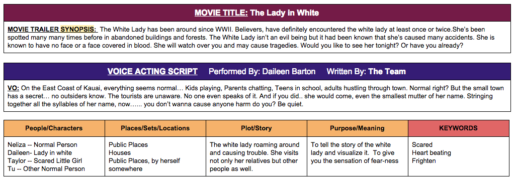
Last quarter, we did a project name The Lady In White. It was a movie trailer that we asked to do. You can think of any movie that you have seen or you can think of one your own and act it out. Ours was from a story. My teammates were Neliza, Taylor, Daileen & me. In the movie trailer The Lady In White, Daileen was the main character, she was the lady in white, Taylor was the sacred little girl and so was Neliza, I was just a normal person. I edited some shot, scheduled time for the team to meet.


The project requirements were to appropriate for Kindergarten kids, timing has to be from one and an half to two and an half minutes, at least five scenes, voice acting script, text layovers, filter and music, those were the main ones. We completed all of them. Our trailer I think was appropriate for the audience. But we could have done better by make it a little more funny, because the audience are the kids, and they like things that are funny. Of course, our trailer was not a funny one, it supposed to be a little scary. We were going to put some more scenes in, then we realized that we had to make it APPROPRIATE for the audience, so we refused to not put them in.


Most our classmates voted us satisfactory. I agree with them. We could have done better. Lucky, none of our scenes were repeated. My team worked really hard on editing, that was the hardest part & took a long time. I learned that it is very important to work together when you are in a team. You can get all your scenes done in just one day if you work together. Each person of our team knew what they were supposed to do, no-one was playing around. I just love all of my teammates, they did a really good job!! I am very proud of our movie trailer.


Tuesday, December 16, 2014

Movie Poster Promo


The main character in the poster is The Lady In White, Neliza and Taylor. They were in the dark, their faces look scared, and the ghost was behind them. The Lady In White will appear when someone says her name, Neliza and Taylor said her name on accident and now she is after them. Tu is their friends, she does not seem very interesting in those things, she never said her name or even bother saying it.

My title was used by color overlay, shadow, gradients and more but those were the main things. Other texts were in bold and fronts that are easy to read. Kerning is the adjustment of space between the letters/characters to make them more visually appealing. We use it so the texts will show up more and easy to read. In another way, it uses to appealing touch to the texts.

I used a lot of black and white colors. Because our title was the lady in WHITE so black background will make her ''pop-up'' more. I used layer effects, filters and kerning to make it more appealing and help the poster look more scary. It made a positive effects. Even though, it did not turn out like I wanted it to be which is really scary but our teacher said that it has to be appropriate for kindergarden age. I did not want to make it really scary for them. However I think I did a pretty good job on the poster. I am proud of it. :)


Monday, December 8, 2014

Proactive or Procrastinator

I am a proactive person, but also a little bit of procrastinator. I am a proactive person because I always turn my homework or my works on time, always prepare for things before one day. I am also a little bit of a procrastinator because sometimes I had homework and it was Friday near the weekend so I just thought that I can do it tomorrow, and then tomorrow I forgot to do it so here it comes Sunday!! I got stressed out, panicked and had to stayed up late to do homework. But I don't usually do that, I might do it sometimes because I might have friends come over, or come home late, etc.

My level of my productivity relates to my amount of free time is by if I have work to do that due tomorrow or even next week, I will try to get it done today, as soon as possible. So I will have free time to do what I want to do. But sometimes when I'm texting my friends, or talking to my friends, I can hardly get my work done on time. Because I got into to those things easily. Example: I can get my all my work done in 30 mins, but when I'm texting or talk to my friends, it takes me hours to finish it.

What I would change about my work habits is to put those electronics stuff away or tell my friends that I have homework to do, she needs to stop talking to me,..... If I can do that I would get my work done on time, don't have to wait until the last minutes to get stressed out. But sometimes, it is hard to resist from those things. Education is more important than texting. Put that in your mind.


Wednesday, November 12, 2014

My Visual Poem


My poem was about canine- which means the relationship between human and dog. It makes an impact because it represents dog is not just a simple an animal, it means a lot. It helps people to understand more about the relationships that their dogs are giving to them.

I used aged film, artifacts, and more,... One of them I used aged film because it shows that our relationship have lasted for a long time. I have never had a dog that I can keep more than one year. The reasons are because their behavior were bad, they barked all the time, chased the chickens and even killed them. So to me Coco (my dog's name) is special. Because he's none of those. Well ya he did chase the chickens, of course because he's a dog and dogs chase chicken. But if you tell him to stop he will stop.

I am satisfied and also unsatisfied with my results. I'm satisfied with it because in my life I have never done it, never film and actually got to edit it so I think I did it pretty good for the first time by myself without needing any helps. I am also unsatisfied because I could have done better by film more videos. I put a lot of pictures in it insteads of putting more videos.